Space Design: Putting the Pieces in Place

I just flipped our shiba inu calendars to August.  Aside 1:  How is it August??  Aside 2: Yes, plural.  Our love of the shiba is sufficiently well-known that we received two shiba calendars as gifts this year.  There's more than one wall here at HQ, after all.  But, to my point, it is now August.  This is the month Shiba Ramen construction should begin!  Our building permits have been issued, and we're seemingly days away from hiring a general contractor.  Aside 3: I've said "days away!!" every week for the past month, but getting these contractor bids resolved is an almost unbearably slow process.  But this time I really mean it.  Maybe.  

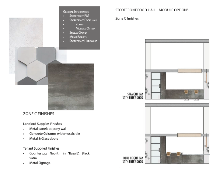
Shiba Ramen.  More or less.  We've had to cut the bar seating due to obscure regulatory requirements.  The storefront elevation diagram below shows the change.  This image does not reflect what the tile will actually look like.  For a more accurate view, see the image below. 

The point, dear readers, is that we have something to build and we're ready to build it.  We have a space design that we're really excited about, and that's just a part of the exceedingly complex architectural plans for the whole operation.  Seeing how much goes into a sub-400 square foot restaurant space is eye-opening, to say the least.

Over the past few posts, I've explained our approach to space design, from the aesthetic we're trying to create to the many external forces that shaped our decision-making.  This time, I'd like to show you where we ended up, and give you a preview of what Shiba Ramen will look like.  With any luck, I'll be posting pictures of the real thing in a couple of months.  

Storefront Elevation Diagram.  Everything to scale.  Here you can see that the bar seating has given way to a standing area.

Decisions, Decisions

So here's how we struck a balance between our design goals and the competing constraints on design freedom.  We chose to focus on four elements: color, tile, wood, and lighting.  The first element--color--was an easy one.  Shiba Ramen's signature color is a crimson red, so it is critical that that color is prominently featured in our first location.  The storefront sign above our kiosk, a backlit strip of water-jet cut aluminum, seemed like the ideal (and most appropriate) place to deploy the Shiba red.  But we wanted the red to play more of an accent role on an overall basis, rather than a dominant one.  So we decided to feature it on the edges of our visible shelving and menu board strips.  Our pendant lamps are orange-red, not an exact match with the Shiba red.  What can you do.

Asanoha Tile.  

To accompany the red motif, we decided to incorporate a blue in our tile.  Although the hoshi tile comes in "clay" (sort of a brick color), which may well have worked with the red theme, we thought a cool blue would look great as a backdrop for the red.  It provides a nice contrast, and because we love blue, we wanted to find a way to incorporate it into the design.

For the tile, the hardest part was finding a place to put it.  Because we have to use the landlord's blackened steel panels under-counter, a different location was necessary.  We solved this problem by incorporating a customer-facing drop ceiling behind the point of sale.  The hoshi tile will be done as a blue-to-white gradient from the left side.  We will use a small amount of gray tile to help intermediate the transition.  The menu board will hang over the right side of the drop ceiling, directly behind the register.  

Wood Elements.  Blade sign (left) and mock-up of menu board (right).  Prices not to scale.  

We are using wood in a couple of ways.  First, we'll use a set of engraved plywood strips for the menu board, with the edges painted Shiba red.  We'll also use plywood for the blade sign, engraved with the Shiba Ramen logo.  But the big wood element is the slatted pine soffit that hangs above the counter and extends down the wall alongside the point of sale.  The soffit is comprised of a series of adjacent triangular segments, with the wood in each oriented perpendicular to that in the next.  On top of that, the surface is three-dimensional, so that the triangles will undulate along the length of the space.  Where the soffit runs down the wall, we will overlay a stenciled asanoha pattern to tie the tile motif into the wood element.  Our view is that the angular and geometric nature of the wood soffit will tie in nicely with the similarly angular asanoha tile.  

Soffit. This behind-the-counter view shows the three-dimensional nature of the pine soffit.  

For the over-counter lighting, we are using a set of four pendant lamps.  These so-called "chouchin" lamps are made by an Italian company, Foscarini.  But they are inspired by Japanese design.  Chouchin are traditional Japanese paper and bamboo lanterns.  You've certainly seen them before.  The Foscarini lamps are sleek blown glass renderings of this historic lighting element.   In other words, it's the exact kind of thing we want to showcase at Shiba Ramen.  

Lights! Foscarini's "Chouchin" collection at left.  We're using the smaller orange pendant.  Japanese chouchin lamps at right.

Note: all of the fantastic images above were produced by our design partner, Misa Grannis.  We worked closely with her throughout the process of putting this together.  She did the heavy lifting and put together a great design package that we were proud to stand behind.  Hiroko and I contributed mostly be musing, opining, and trying not to be annoying. 

On the Hunt for Tile, a Visit to Edo Japan: Japanese Geometries

We get excited by tile.  Probably to an abnormal degree.  Tile is capable of infinite variation in pattern and color.  It can deliver a look of striking complexity or clean simplicity.  If you're looking for a signature design element for your space, whether in your home or in a ramen restaurant, tile can provide it.  Two years ago, after months of searching and planning, we installed a custom-colored cement tile floor with a traditional Mediterranean-style pattern in our sunroom.  That fantastic experience made it a near-certainty that tile would be an integral element of Shiba Ramen's inaugural design scheme.

Cement Tile.  Toro sunbathes in the sunroom, on our "Bayahibe" tiles that we bought from Avente Tile.  

Cement Tile.  Toro sunbathes in the sunroom, on our "Bayahibe" tiles that we bought from Avente Tile.  

Now the other thing we love:  geometric design.  I spent years being fascinated by the endless hexagons and pentagons, the lines, the symmetries, and the repetition found in chemistry.  I loved the way molecules looked, and I took great pleasure in drawing them, designing them, and building them.  It's no surprise, then, that geometric patterns have featured in our home renovations, especially through the repeating quatrefoils on our sunroom floor.  If there's any material capable of delivering an awesome geometric look, it's tile.

Tile + Geometry + Japan

It didn't take long for our search for geometric tile lead us to early modern Japan.  Japan in the Edo period (ca. 1600-1868) is a renowned epoch of artistic achievement, especially in the graphic arts.  Ukiyo-e ("pictures of the floating world") prints remain captivating today, as evidenced by a fabulous exhibit at San Francisco's Asian Art Museum earlier this year (one that I attempted to enjoy until I had to throw down with a combative and excitable toddler halfway through the first gallery--it was Mother's Day, so Hiroko got to roll through relatively unmolested).  

Traditional Japanse Patterns.  You've probably seen some of these before, especially the seigaiha pattern at lower left.  Images taken from Patterns and Layering: Japanese Spatial Culture, Nature and Architecture.  You can download a pdf of the first chapters here.  I'm waiting for Amazon to get the whole book in stock so I can get a hard copy.

You don't have to look at much ukiyo-e to appreciate the sumptuous fashion on display in Edo Japan.  Images of courtesans and samurai abound, the subjects often clad in layered garments, replete with varied colors and--to our point--geometric patterns.   It turns out that this use of geometry has been deeply integrated in Japanese design for hundreds of years.  And some of the very same traditional patterns used in the art, imagery, and fashion of feudal Japan are still in regular use today.

Traditional Look, Modern Look

But don't let the word "traditional" give you the wrong impression.  The amazing thing about these Japanese patterns is just how modern they look, and how easily they fit into contemporary design.  The reality is that once you become aware of these patterns, you start seeing them everywhere, not only in Japan, but even here in the U.S.  OK, maybe not so much in my native Akron, Ohio (the home of LeBron James!), but certainly here in the Bay Area.  Perhaps we shouldn't have been surprised when, just last week, we saw the Japanese pattern we're using at Shiba Ramen--asanoha--used in curtains in a CB2 catalogue, and in a piece of wall art in a West Elm catalogue.  

Let's Buy Some Tile

Given the design constraints in our small space, we knew we had limited opportunity to deploy tile, so we had to make it count.  But there was little question that we intended to find that opportunity in the first instance.  After Misa put the Soli hoshi  tile on our Pinterest board, we didn't have a hard time making up our minds to use it at Shiba Ramen.  It conveys the modern Japanese look we're going for; it references a Japanese design tradition without seeming traditional.  It can work in a modern food hall in Emeryville, CA.  And, to come back to where we started, it is an incredibly cool geometric pattern.  

Asanoha Tile.  This is what we're using above the counter at Shiba Ramen.  A mosaic of "hoshi" tile from L.A.-based tile vendor Soli.  This image from the web is what caught our attention.  We're doing a fade from sky blue to white, with gray intermediating the transition.

The tile also has the capacity to deliver a bit of much needed color to our space.  As you'll see next time, our color palette is pretty neutral, and there is little opportunity to deviate.  The metal "Shiba Ramen" sign above our kiosk will be the crimson of our logo and we'll use red-orange hanging pendants over the counter.  But we wanted to offset the red with a cool blue, and that's something that the hoshi tile (in sky blue) will do for us.

As of today, the hoshi tile has been in our basement for over two months, awaiting the big day of installation early this fall.  We were worried that Soli would run out of stock and we'd be unable to get the colors we wanted.  This stuff is not cheap (around $28/sf), and that's fine because we're using such a small amount, but if we'd wanted to custom order the tile, the minimum order was 300 sf.  Obviously, custom ordering the tile was a non-starter, so we acted fast and made a final final decision months in advance of building.  This tile is not returnable.  

Space Design: Getting Our Act Together

Here's the part of the Shiba Ramen project we'd been waiting for: trying to design a great-looking space that projects the look and feel we want to establish for our business.  This is our prototype location.  It's our first experiment in using space design to help shape Shiba Ramen's image.  We get a chance to have fun with building materials, colors, and design motifs and we're forced to think about how image flows from those elements both individually and used in combination.  Even if I didn't love this stuff (I do), it would still be a lot more enjoyable (read: less ulcer-inducing) than getting permits, finding contractors, and funding construction!

Shiba Ramen Signage Diagram.  Let's design a restaurant to go with it.

But to say we can be creative is not to say that we are unconstrained: in fact, we have very few degrees of design freedom compared to your average free-standing restaurant.  We don’t have a dining room or a true exterior, and most of our sub-400 square foot space is dedicated to the food prep essentials.  On top of this, the finishes for the façade of our kiosk are mandated by Public Market as part of their holistic design scheme for the food hall.  Like I said, this is a prototype and it's a good starter project (not to mention a lot cheaper than building out a full space).  But we want to design bigger spaces down the line, so we're looking at this as a training exercise of sorts.  

Even with our constraints, I think we're making the most of our limited design opportunity now that we have a final design on paper.  So long as the regulators don't muck it up with tight-fisted and meddlesome nitpicking over code technicalities, that is (more on regulators later, once that story is fully and finally resolved). 

Public Market Finishes.  The Public Market mandates these finishes in our area of the food hall.  Other areas employ a similar neutral color palette, but materials include reclaimed wood and glass tile.  We will use a dual-height bar,…

Public Market Finishes.  The Public Market mandates these finishes in our area of the food hall.  Other areas employ a similar neutral color palette, but materials include reclaimed wood and glass tile.  We will use a dual-height bar, but without any seating.  Thanks, regulators!

Not Nearly Do-It-Yourself

Now when it came to designing improvements to our house, we selected the materials and put something on paper ourselves.  But even though our Shiba Ramen space is small, it was not an option to go solo on this project. The landlords required us to submit a detailed package of technical space design drawings (“SDDs”), and we needed a trained professional to put those together.  We also wanted somebody with great design sense to partner with us and ultimately take ownership over the process.   

Wood and Geometry.  These wooden structural elements and geometric patterns influenced our thinking, as you'll see in the next post.

Beyond this project just being way, way more technical than even sophisticated DYI projects, we don't have the luxury to spend time going painstakingly through the weeds on this.  By day I have to think about the billable hour (gross), and there still has to be time to experiment with ramen, taste beers, run down the ever-expanding list of startup tasks.  And did I mention there's a small child running amok over here at Shiba Ramen HQ?  We have to water our tomatoes, play Candy Land, eat.  Life.  That sort of thing.  We obviously needed help.

We brought on ramen-loving Japan enthusiast and fellow Oaklander Misa Grannis to work with us.  Misa had done a fantastic job on our logo last fall, and we thought the space design was a great opportunity to get her more involved with our project.  After working with her on the logo, we understood her that aesthetic sense was totally aligned with ours.  Modern design, Japanese influences.  We also trusted that she'd do a great job as a design professional, so she was definitely the partner we wanted on this project with us.

Gathering and Sorting  

We have precious few opportunities in this small space to realize our design goals, so it's critical that we select the right materials and structural elements.  And it's just as critical that we don't overreach and try to do to much.  So we spent several months just thinking about our options.  Our approach, at Misa's suggestion, was to use a shared board on Pinterest.  This allowed any of the three of us to pin images of restaurant designs, lamps, tiles, design motifs, etc., that we we found on the web.  And we could have an informal dialogue by leaving comments for one another on the pins. This was actually a really useful way of aggregating ideas, filtering them, and coming to a consensus on our design direction.

Pendant Light Runners-Up.  Here are some lamps that we seriously considered, but in the end decided against.  Click for links to the products: left, middle, right.  Allmodern.com and ylighting.com are great places to shop for cool lighting.

I Love Tile. The availability of colors, patterns, and shapes is nearly limitless. The one on the left from Popham Design (which sells truly stunning cement tiles, by the way) uses a traditional Japanese "asanoha" pattern.  As I'll explain in a future post, we are using an asanoha tile mosaic in Shiba Ramen, although with a different tile.  

It was important to us that four elements were deployed in the design: wood, tile, lighting, and color.  And we needed to incorporate these elements in a tight physical structure that maximized the overall appearance without compromising the function of our restaurant.  We had to consider what kind of window our bar and point of sale space would provide into the food prep going on in the kitchen.  

In a perfect world, we would have used wood or tile as the surface facade under the bar and point of sale.  But because we were locked into using the landlord's pre-selected finishes (see renderings above), we had to find a way to implement these elements behind the counter.  And everything had to be executed in a way so as to complement and not compete with the landlord's finishes (fortunately, those finishes create a foreground that fits well with the aesthetic we're looking for).  The ultimate point was to be thoughtful and balanced as we put the pieces together.

In the next posts, I'll show our our final design: the materials we selected and how we're putting them together.  I'll also take detours into a couple of the really cool Japanese design elements we thought about using along the way.

Space Design Back Story: Oakland's Most Dangerous Garden

We've been waiting to get into the design piece of the Shiba Ramen project since we decided to open a restaurant a year ago.  The chance to work on design projects helped push us toward starting this kind of business in the first place.  But this week, when I sat down to write about our design, I found myself writing not about Shiba Ramen, but about the home renovation projects that, more than anything else, expanded our imaginations to the point where we could even conceive of starting a ramen business.  So if you'll bear with me (thanks) let's take a short diversion to my back yard.

Shibas.  In the garden, taken earlier this morning.  

Shibas.  In the garden, taken earlier this morning.  

A few years ago, we bought a house in Oakland.  In exchange for getting a good deal on the price, we signed up for lots of deferred maintenance (roof, electrical, seismic retrofit, etc.) and much-needed cosmetic work.  We retiled the floor and resurfaced the walls in our sunroom, spending a lot of time thinking about tile and even more time covered in thinset mortar and drywall mud.  We converted the nasty-ass 1960s man cave in the basement (fully equipped with tufted white vinyl wet bar, naked lady ice cube trays, and a sign that said "If you had it last night . . . smile") into a colorful play room.  Before the retile and the man cave, we totally overhauled our back yard, building a pergola, a fence, a patio, rock stairs, raised beds, and planting a botanical garden's worth of the insane array of plants you can grow in the Bay Area.  

A necessary predicate to building our little backyard oasis---still incomplete, by the way, with funds for the glorious deck of our dreams diverted to opening a ramen restaurant---we had to demolish a grand eyesore of concrete and stone; one that combined the aesthetics of the Classical Mediterranean with those of Mordor, with some faded aquamarine paint for a splash of color.  It was a downtrodden concrete pond, over which a concrete floating stair bridge led to a badly decomposed and submerged-in-dirt brick patio.  On the terrace patio, reminiscent of some dilapidated Acropolis, ten white wooden columns were arrayed in a square, but whatever roof they once supported was long gone.  Big brown quartz rocks were cemented all around the concrete pond, and smaller jagged quartz rocks were studded into every step of the bridge.  The bridge was supported by long pieces of rebar anchored into 18-inch thick concrete blocks at each end.  

This fucking bridge survived the 1989 Loma Prieta earthquake unscathed.  It was formidable.  It was hideous.  It was dangerous for children.  Like really dangerous for children.  There was actually a sign at the open house warning prospective buyers of the threat to their children that the backyard presented.  Anyone who has taken the California bar exam was forced to learn about "attractive nuisance."  This is an obscure legal doctrine that makes landowners liable for the injuries of trespassing children, where the land contains some feature that attracts unsuspecting children to their doom.  This bridge/pond business in my yard could have been a great hypothetical for bar study.  Fortunately, I got rid of it before the lawsuits started pouring in!

And I got rid of it with extreme prejudice.  It turns out I really love demolition.  So as soon as we closed on the house, I went to Home Depot and got a sledgehammer, and then I beat on the bridge methodically until it was just a bunch of exposed rebar.  But when the sledgehammer proved useless on the thicker concrete, I had to go back to Home Depot.  This time for a jackhammer.  Said the customer service dude: "You ever used one of these before?"  Said me: "No."  Said the dude: "Please sign here."  Said the day laborers hovering around in the parking lot as I wheeled the jackhammer to the car: "That looks like a two-person job."  Said me: "Thanks, I've got it."    

I had it, but barely.  Jackhammers are heavy.  So I brought it home and got to business.  It did the trick on the thick concrete, but that wasn't the end of the story.  There was so much concrete in the yard, in various places, that even after the bridge was gone I was sledgehammering intermittently for months (breaking my first sledgehammer in the process and needing a second!).  I produced a staggering amount of rubble and had to spend $2000 just to get rid of it.

While the demo was underway, Hiroko and I set about designing a new garden.  We spent absurd amounts of time at Home Depot, American Soil & Stone (I seriously love that place), Ashby Lumber, and any number of East Bay garden centers.  We bought 3000 pounds of ledge stone, 10 cubic yards of dirt, 8 cubic yards of crushed lava, black basalt patio stones, Mexican pebbles, and lots of redwood.  We read books on landscape design and construction, figured out our plan, and went out and built our garden.  This was a pretty huge project, and Hiroko was pregnant during the entire affair.  That didn't stop her from mortaring cinderblocks and excavating trenches, though.  We did every bit of the labor ourselves (except the rubble removal).

Three Years In.  Our garden today, getting greener every year.  

I think that, more than anything else, this garden project prepared us to undertake Shiba Ramen.  It showed us that we were capable of going outside of our comfort zones, learning completely new skills, and applying them to a complicated multi-stage effort.  We learned that we loved design and loved building things, although the fact that we both spent years designing and building molecules in the lab suggests that these interests were always there, but just needed the right outlet.  Perhaps most importantly, Hiroko and I learned how to work together really effectively, and developed a much deeper understanding of how our individual skills complement one another.    

Next time, we'll leave my yard and head back to Shiba Ramen.

Design For Function: Building a Ramen Kitchen

Shiba Ramen's space measures just around 385 square feet.  Today, it's an empty square framed by metal studs.  But over the next few months it will transform into a functioning restaurant kitchen.  And not just any kitchen, a ramen kitchen.  Our business is all about producing a large volume of a single core product, in several variations and with just a few select sides.  Our kitchen setup needs to ensure we can do that.  

And pretty much that alone.  There's no space to spare for equipment--ranges, freezers, etc.--that we don't absolutely need.  The health department requires us to have 7(!) sinks, so it's a tight fit back there.  And the space has to flow, with the ramen being assembled mechanically, moving from back to front, ending in the hands of the customer.  Other tasks need to be performed--cleaning dishes, preparing sides--without getting in the way of the ramen.  

So this spring, with the aid of a professional kitchen designer, we set out to build our Ideal Ramen Kitchen.  Having never designed a restaurant kitchen before (or any kitchen, for that matter), we just started off with the good old Internet, trying to figure out the kinds of equipment we would need, then making a list and ballparking the costs.  Hiroko found some Japanese language sources that had schematics for small ramen restaurants, which gave us a rough cut at an equipment list.  Then we headed to some online restaurant equipment vendors to get a better look at the individual pieces.

We Can't Forget About You!  Draught beer is an essential part of the ramen experience, and must be in our kitchen.  

We Can't Forget About You!  Draught beer is an essential part of the ramen experience, and must be in our kitchen.  

Professional Help, Please!

But this is the kind of thing where you definitely want to get some professional input if you haven't done it before.  We did that in two ways.  First, Hiroko went to ramen school where she spent nine days in a ramen kitchen, learning from a guy who designs these kinds of kitchens for a living.  This is the level of information we had when we then connected with our kitchen designer; confidence in the equipment we'd need to make ramen and how the ramen pieces needed to fit together, but pretty clueless about how to make sure the kitchen has all things necessary and proper to make it up-to-code in Alameda County and in conformance with industry best practices.

And this is where the kitchen designer added tremendous value for us.  He was able to translate our need-to-haves and want-to-haves into a workable whole, filled with all the eye-openingly granular detail that goes into a restaurant kitchen.  He knows the health codes that must be followed, and had lots of ideas about how we could achieve the level of functionality and convenience we wanted for our kitchen.  It didn't hurt that the designer we worked with, Michael Scheiman at Myers Restaurant Supply (a one-time chef), had just finished designing a kitchen for another local ramen shop.

17-Seat Ramen Restaurant.  Floor plan for the entirety of a small typical Japanese ramen shop. Link here: http://r-mugendou.com/syohin/tyubo/if/ramen.html

17-Seat Ramen Restaurant.  Floor plan for the entirety of a small typical Japanese ramen shop. Link here: http://r-mugendou.com/syohin/tyubo/if/ramen.html

Here's how the process worked.  When we sat down with Michael the first time, we talked through the whole kitchen.  The point was to convey what specific functions we need our kitchen to perform: we need to make various kinds of ramen with a range of prep requirements, fried chicken (naturally), gyoza, rice.  We need to have beer on tap (naturally) and a water dispenser.  We need to have enough refrigeration of the right kinds, prep surfaces, stockpot ranges, noodle cooker capacity, the right heating elements, etc.  And it all needs to be set up to facilitate smooth ramen assembly.

Michael and his team then went and put our kitchen on paper, with everything laid out to scale based on specific pieces of equipment, all set out in an accompanying list.  All the code necessities, sinks and drains and shelving, electrical boxes, employee lockers, were filled in.  Over the next few weeks, we thought pretty intensively about the details in the draft, and had a back-and-forth with Michael to make miscellaneous changes; shrinking the number of ranges and the size of the griddle, adding and relocating prep space and heating wells for the broths, changing the location of the water dispenser, that sort of thing.  

A First Cut.  This is the preliminary layout assembled by our kitchen designer.

Vetting and Refining the Design

Once the preliminary design was in place, we had a big team conference call with the kitchen designers, the architect, the space designer, and the landlord's people.  Everyone took turns asking questions about things pertinent to their respective zones of interest, and Michael's team made changes to the rendering in real time through a screen share.  We also happened to be in Japan the week we were finalizing the design, so we showed the preliminary rendering to the ramen school people and got some advice about the fine details.  I recall walking around Tokyo and emailing with Michael about making sure we had appropriate freezer storage for ice cream, after we'd decided late in the process to serve monaka, a Japanese-style ice cream dessert.  He wanted to know the fat content of the ice cream we expected to use (we had no idea), so you can see just how detailed these issues become.

Preliminary (Top) and Final (Bottom).  You can see what changed from the preliminary design.  Among other things, we reduced the number of gas ranges from 6 to 2, shrunk the size of the griddle and rice cooker, and reoriented the process f…

Preliminary (Top) and Final (Bottom).  You can see what changed from the preliminary design.  Among other things, we reduced the number of gas ranges from 6 to 2, shrunk the size of the griddle and rice cooker, and reoriented the process flow by moving the two stockpot ranges off to the side and out of the live prep area.  Bottom center is where the ramen action happens.  The soup and noodles are assembled on the prep surface in between the noodle cooker (22) and the broth-containing heating wells (11).  The partially assembled bowl is passed over a short "pony wall." to a finishing station across from the bar/point of sale.

When the details were in place, we submitted the design to the landlord for approval.  After a little back and forth, the landlord approved it.  Michael's team then went ahead and put together a serious package of drawings and specs, with extensive detail about necessary plumbing, electrical hookups and load requirements, and so on.  This was handed over to the architect, along with the "Space Design Drawings" put together in parallel by our designer, and provided the basis for the construction drawings that are now getting reviewed by regulators and bidding contractors.   

So, suffice it to say, the kitchen designer was pretty essential for us.  We were fortunate to work with somebody who clearly understood his business and who was on the same page with us.  This gave us confidence that our job was going to be done the right way, and the details were going to be taken care of.  We learned a ton and will be a lot better at speaking the language and understanding the parameters of kitchen the next time we do this.  

Now we just have to buy our equipment, build our kitchen, and start making ramen!

Next time at Ramen Chemistry, we're on to space design.