I have a confession to make: I don’t speak Japanese. I can’t read it or write it. I do understand lots of words and phrases (foods, cultural miscellany, petty vulgarities), but that’s pretty much it. Nevertheless, I live around Japanese, I hear it and see it every day in my house, and I’ve learned a lot about it over time. Critically, this level of knowledge is enough to make informed decisions about how, if at all, Japanese language should feature in Shiba Ramen’s brand image (especially because we have an in-house technical expert).
Earlier this year, I wrote extensively about our logo design strategy: suggesting Japanese authenticity while seeking American accessibility. We wanted to use Japanese text in the logo, but we knew we’d need to strike a delicate balance if we did.
I’m going to explain how (I think) we struck that balance, but first I need to explain a fact about Japanese language that is pretty surprising for westerners: Japanese uses three sets of written characters.
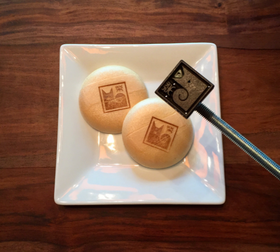
Shiba Ramen Logo, Cast-Iron Brand. We use a single Chinese character (kanji) saying only "shiba." The text font and the logo itself evoke a traditional Japanese hanko stamp (see below). Here with our Shiba Scream ice cream prototype (minus the ice cream).
Two Syllabaries: Hiragana and Katakana
English is written with a set of 26 Roman letters known as “the alphabet.” But alphabet is actually a technical term: it means a set of letters, usually arranged in a fixed order, each one of which represents a perceptually distinct sound. Japanese is a little different. It doesn't use an alphabet; instead it uses a syllabary. The characters in a syllabary each represent an entire syllable, instead of just a sound. For example, the syllable “ba” is made up of two distinct sounds, “b” and “a.”
Actually, Japanese uses two sets of parallel syllabaries, known as hiragana and katakana. Hiragana and katakana have just under 50 characters each, which represent the same set of sounds. The only obvious differences between the two are their visual appearances. The hiragana and katakana characters for the same sound typically look quite different, and the overall appearance of katakana is sharper and more angular.
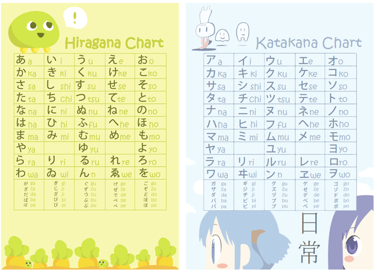
Japanese Syllabaries. http://szmoon.deviantart.com/art/Green-Tea-Hiragana-Chart-61880535
At this point it's only understandable to ask why in the world the Japanese need two sets of characters representing the same sounds. The historical answer is that the two character sets evolved separately in medieval Japan, both as simplified versions of Chinese characters (kanji). Interestingly, katakana were typically used by men, who controlled the translation of Chinese literature and the writing of official documents. Hiragana, meanwhile, were considered women's script, and were used in unofficial communications like personal letters and literature. Apparently, Japanese women traditionally wrote Chinese characters in a cursive style, which is why hiragana has a decidedly more cursive appearance than katakana. Eventually, the gendered usage was abandoned, and the two scripts took on different functional uses.
And that's how things stand today. Hiragana is set that is used for Japanese words, especially those that can't be written with kanji. Katakana is the set used for foreign words and names, onomatopoetic words (lots of those in Japanese), and for emphasis (as we use bold or italics).
So why the need to signify foreign words with a separate character set? For one thing, the Japanese borrow a lot of words from other languages. But so does English, so what gives?

I'm Actually Wearing This Right Now. Katakana in Action. グッド・タイムズ = "Guddo Taimuzu" = "Good Times"
Well, something funny happens when words from an alphabet-based language are written in a syllabary. Look at it this way. We can combine and manipulate our Roman letters to represent almost any sound, although we often have to memorize a word's pronunciation as a result. In a syllabary, the sound is manipulated, as well as the spelling. All of the syllabic characters in Japanese are either stand-alone vowels (a, e, i, o, u) or a vowel paired with a consonant (i.e., ha, ba, na, ka). There is only one stand-alone consonant (n). Everything must be spelled using this limited universe of sounds, each of which is always pronounced the same way.
Any foreign word must be modified so that it can be written and spoken in Japanese, unless, of course, that word is comprised only of syllables in the Japanese set. Use of katakana signals that a word is not Japanese; that it has been altered to fit into Japanese.
Here are a couple examples. It’s impossible to write my name (Jake Freed) in Japanese, because Japanese has no standalone “k” or “d” and no “fr” consonant blend. My name becomes “Jeiku Furido.” And some of my absolute favorites: Starbucks becomes “Sutaabakusu.” Alcatraz becomes “Arukatorazu.” McDonalds becomes Makudonarudo. Lots of extra vowels, no letters like “L” or “V.” Katakana would be used for all these words. By the way, the Japanese are also very proficient at abbreviating words. Sutaabakusu becomes Sutaba; Makudonarudo becomes Makku.

Katakana. Makudonarudo Hanbaagaa = McDonald's Hamburgers
One Logography: Kanji
If things aren't tough enough yet, it gets yet more complicated. In a single sentence, you might see hiragana and katakana. You will probably also see kanji. Kanji are logographic characters, which means that they are associated with meanings, not sounds. They were imported to Japan from China in late antiquity. Many characters are similar or even the same in Japanese and Chinese and, for that reason, a Japanese person who doesn’t speak Chinese can often understand the rough meaning of basic written Chinese, even if they have no idea how it sounds.
There are well over 5000 kanji, but most Japanese only know a fraction of these. Japanese kids are required to learn a government-mandated set of 2136 by the end of high school, and those are the ones that are typically used in newspapers and media publications. Some kanji are inordinately complex or obscure, and they can be hard to read, let alone write. But if you understand them, kanji are more efficient for reading: symbols can convey the same amount of information in less space than letters can.
Back to the Logo
For Shiba Ramen's logo, we wanted to use some Japanese language element. We considered using either hiragana or kanji. We initially looked at some designs that said “Shiba Ramen” in both English and hiragana. Although we liked the hiragana, the look with a single kanji (“shiba”) was just cleaner and more refined. Using two kanji would start looking Chinese. Incidentally, “ramen” is often written in katakana in Japanese because it's actually a foreign (Chinese) word.

Hanko Inspiration. Remembering the old Uniqlo soy sauce t-shirt in my closet (left) led us to our logo font. This shirt was done in the style of a hanko stamp (right).
Just like Roman letters, Japanese characters come in all sorts of fonts. The reality, though, is that many of the available fonts are meant to evoke calligraphic brushstrokes. Our view was that brushstrokes were too traditional for Shiba Ramen, so we spent some time looking for alternatives better suited to the image we want to project. After a few days of waffling, I recalled the kanji on the back of a soy sauce t-shirt Hiroko bought for me at Uniqlo in Japan over 10 years ago. I dug it out of the closet and showed it to Hiroko. This font used clean lines of uniform thickness and right angles.
Hiroko explained that this font is the kind used on a hanko stamp (the stamps all Japanese use to sign their names on official documents). A hanko-type font, we realized, would fit with our more modern image while still retaining something of the traditional Japanese. We played around with a few hanko-type fonts, picked one, and our logo was complete.