
The Periodic Table is open! This is practically old news at this point--it's been over two months already. As usual, construction seemed plodding; it started slower than expected and then there was an unfortunate setback when a contractor ordered (and partially installed) the wrong long-lead-time tile just as things were starting to move. That cost us at least a month. Not a huge deal objectively, but not great for our mental state. We were feeling almost desperate to reverse the cash flow situation, with all the capital outflow this year opening two stores, plus the slower summertime business and the drag of road construction on our business in Public Market. Finally, at the end of August, about a year after starting the project, the construction barricade came down to reveal a stunning little space.

Photo: Eric Rorer
Functional Design
Coming in at under 400 square feet, The Periodic Table is a compact operation. Perhaps the most important feature is the pass-through window to Shiba Ramen's kitchen. Being "contiguous" with Shiba Ramen allowed us to use the same alcohol license for both storefronts. The Dept. of Alcoholic Beverage Control ("ABC") told us to build TPT in the next kiosk and "knock a hole in the wall." On one side, Shiba Ramen Corporation does business as Shiba Ramen, and on the other as TPT. We couldn't have done TPT as a standalone bar, because the kinds of alcohol licenses that allow minors to enter the premises (the kind we need in a food court) require a significant percentage of sales to be for food.
But to do this bar in such a small space, we couldn't lose any square footage for food prep. We also didn't want to increase our construction and labor costs by investing in another serious food service operation; i.e., we absolutely did not want to build another kitchen (of course, we could have followed the brilliant suggestion of ABC and gotten a "panini machine" or a "soup kettle" to satisfy the food requirement). The whole point was to piggyback on the infrastructure we already had in place, allowing us to focus on alcohol sales and devote as much space as possible to customer seating.

Shiba Ramen is "Adjacent Tenant." You can see the pass-through window under the back bar.
Every effort was made to pack maximum functionality in the bar area: a back bar cooler for beer kegs with a 12-tap beer tower, a display fridge for bottled beer and sake, a small fridge with worktop for food/drink prep, a dishwasher, and the various sinks needed for code compliance. A hot water heater is stacked on top of a mop sink in a discreet little closet in the back corner. The main bar itself seats 6-7, with another 10-12 seats at the counter that wraps around the room's back and side walls. All the food prep, except for a couple of cold plates, is done in the Shiba kitchen. Above the back bar is a wood lattice shelving unit, where we display bottles and other things. As I discussed on this blog recently, we put a TV in the back of the room.
The compact nature of the project created a real challenge for our architecture and food service design team. Not only did they have to make sure all the functional needs could be accommodated, they had to make sure everything was code-compliant, and that the final product looked great. Needless to say, they made it happen, and without too many hiccups. We successfully deflected an uninformed eleventh-hour demand by the city that we install a grease trap in our essentially grease-less space, the inclusion of which would have disrupted the careful balance created over months of back-and-forth among the many stakeholders in the project. In a science fiction world, perhaps we could have fit a grease trap in the extra dimensions contemplated by string theory; in the real world, we were completely out of space.
Aesthetic Design
We wanted TPT to be a real standout space, so we hired the folks at Oakland-based Arcsine, who had recently done some excellent restaurant work with Agave Uptown and Calavera. The design process was a low-stress, streamlined collaboration. Arcsine began by interviewing us at some length about the concept and our design goals. We were looking to build off of the modern Japanese-influenced design used at Shiba Ramen, while incorporating references to chemistry, science, and alcohol. The use of geometric patterns and shapes would allow us to act on each of these goals simultaneously, given the prevalence of geometric motifs in both Japanese design and chemistry. As with Shiba Ramen, we wanted tile and lighting to be feature elements.
Arcsine presented us with a set of three concept boards: one emphasized traditional Japanese design, one had a chemistry/industrial theme, and one was more playful with extensive use of color. In response, we suggested combining elements of each theme. We want TPT to present sake outside the usual sushi restaurant context, and we want to steer clear of shoji screens, brushstroke kanji, and the like. But we were excited to incorporate wood and Japanese geometric patterns. Similarly, we did not want to create the kind of sterile, monotone space that could result if we tried to make TPT into a chemistry lab. We viewed warmth and color as essential attributes of the space. The next time we sat down with Arcsine, they presented us with the refined composite concept slide below. We were totally on board.

Over the next few months, we sat down with Arcsine for a series of conversations as they fleshed out the design (the images below include a refined concept collage and an interim material palette). We started with the floor plan, making sure the space had all the necessary technical and code features, arranged efficiently and usefully, all while maximizing customer seating. The main bar terminates with a bump-out in the shape of a half-hexagon, creating an intimate space for conversation, either between patrons or with the bartender. The wraparound bar along the back and side walls contains two more half-hex bump-outs, providing additional focal points for conversation and design features. There are low (34") segments of the main bar and the wraparound bar, both necessary to meet ADA accessibility requirements.
The ceiling is closed off above the bar, with a half-hex soffit mirroring the bar bump-out, and oak slats running in parallel from the back bar wall to the front of the bar. The area above the customer area is open, allowing light from the Market's skylight into the space. The oak slats in this area run from front to back, perpendicular to slats behind the bar.

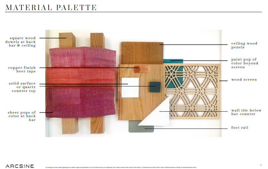
The walls are primarily done in oak veneers, with a couple of exceptions. The bump-outs on the wraparound bar feature gorgeous laser-cut oak screens from Lightwave above the bar, in a custom Japanese tortoiseshell pattern. Below the bar, the screens are mirrored by half-hex tiles from Clayhaus, teal blue with white accents, arranged in the same tortoiseshell pattern. The same tortoiseshell tile mosaic runs along the entirety of the main bar die wall, and is used again, although in plain white, as the backsplash behind the bar. The countertops are deep blue, made from a unique paper-polymer composite material called Richlite. The signature copper-coated beer tower has twelve taps. Butcher block is the countertop material on the back bar. The barstools are plastic/steel in a cool muted blue, from Normann-Copenhagen.

Image: Arcsine
The space also has two features that are direct inspiration from chemistry. The oak shelving lattice behind the bar is comprised of parallel rows of square openings, suggesting the periodic table of elements itself. The reference is an explicit one, with some of the openings covered in colored fabric squares printed with chemical element symbols (H for hydrogen, O for oxygen, Cf for Californium, Nh for Nihonium), a graphic representation of the platinum atom, and our ethanol-molecule logo, among other things. In front of both laser-cut screens are sets of pendant lamps shaped like Erlenmeyer flasks. The lamp is appropriately called "the Erlen," so its designers clearly had chemistry in mind when they developed the product. Side note: this was the one piece of the design Hiroko and I took direct responsibility for, exhaustively scouring the Internet for chemistry-themed lighting. Today we are serving sake by the glass in actual Erlenmeyer flasks.


* * * * *
So the space is pretty amazing. Arcsine came up with a striking design, which UpCycle Builders executed beautifully. The finishes and the carpentry are exemplary (and so are the drinks, by the way). I love spending time there, and I hope other people do too. It would be pretty sad if I didn't, though, because--brace yourself--this little room cost about $350,000 to design and build, financed through a combination of a Small Business Administration loan, cash, and landlord tenant improvement funds. Then add $40,000 for equipment. Total capital investment close to $400K. That's the cost of doing a tiny designer bar space in the Bay Area. The shock of these costs has worn off to a degree after three projects, but it still seems kind of appalling. There are still a few improvements to be made before the space is really complete, but we'll get to them when we get to them. We're working on some graphic educational collateral about our products for the wall, and we need a better sound system.
We obviously need to sell a lot of booze, so if you're reading this please come and drink ASAP, and bring some friends! The burger is great, and you can eat ramen and wings at the bar. Here's where we are with the drink menu: 20-25 sakes, 10 draft beers, bottled Japanese beer and California ciders, a growing selection of Japanese spirits, including whisky, shochu, gin, and vodka, and a small cocktail menu. The food menu is minimalist at present, but likely to grow soon. We have cheese, charcuterie, and house-made pickle plates, all great drinking foods. Sports are on the television. See you there.
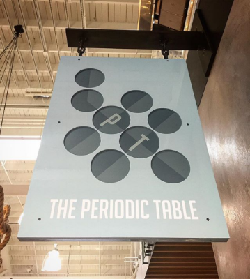
Sleek blade sign fabricated by Sweitzer Fixtures and designed by Misa Grannis.


