
Here's the part of the Shiba Ramen project we'd been waiting for: trying to design a great-looking space that projects the look and feel we want to establish for our business. This is our prototype location. It's our first experiment in using space design to help shape Shiba Ramen's image. We get a chance to have fun with building materials, colors, and design motifs and we're forced to think about how image flows from those elements both individually and used in combination. Even if I didn't love this stuff (I do), it would still be a lot more enjoyable (read: less ulcer-inducing) than getting permits, finding contractors, and funding construction!
Shiba Ramen Signage Diagram. Let's design a restaurant to go with it.
But to say we can be creative is not to say that we are unconstrained: in fact, we have very few degrees of design freedom compared to your average free-standing restaurant. We don’t have a dining room or a true exterior, and most of our sub-400 square foot space is dedicated to the food prep essentials. On top of this, the finishes for the façade of our kiosk are mandated by Public Market as part of their holistic design scheme for the food hall. Like I said, this is a prototype and it's a good starter project (not to mention a lot cheaper than building out a full space). But we want to design bigger spaces down the line, so we're looking at this as a training exercise of sorts.
Even with our constraints, I think we're making the most of our limited design opportunity now that we have a final design on paper. So long as the regulators don't muck it up with tight-fisted and meddlesome nitpicking over code technicalities, that is (more on regulators later, once that story is fully and finally resolved).
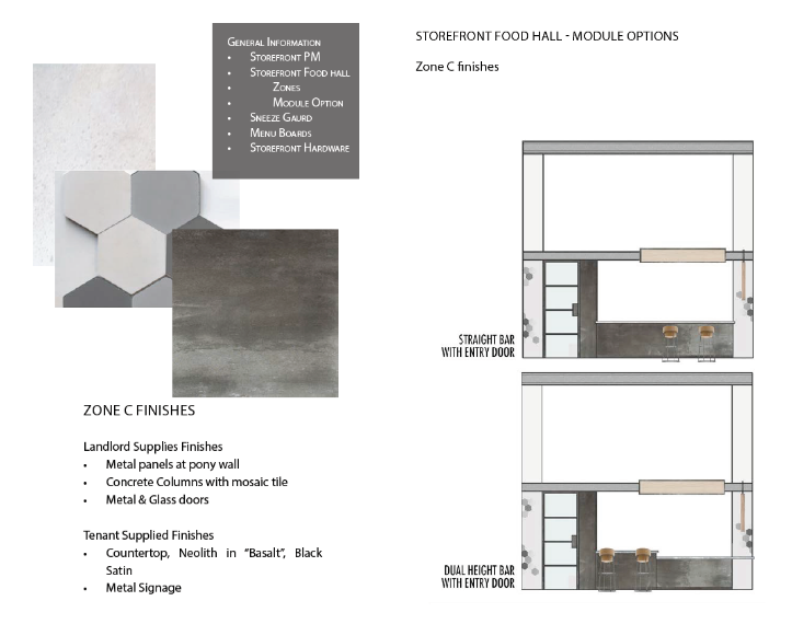
Public Market Finishes. The Public Market mandates these finishes in our area of the food hall. Other areas employ a similar neutral color palette, but materials include reclaimed wood and glass tile. We will use a dual-height bar, but without any seating. Thanks, regulators!
Not Nearly Do-It-Yourself
Now when it came to designing improvements to our house, we selected the materials and put something on paper ourselves. But even though our Shiba Ramen space is small, it was not an option to go solo on this project. The landlords required us to submit a detailed package of technical space design drawings (“SDDs”), and we needed a trained professional to put those together. We also wanted somebody with great design sense to partner with us and ultimately take ownership over the process.
Wood and Geometry. These wooden structural elements and geometric patterns influenced our thinking, as you'll see in the next post.
Beyond this project just being way, way more technical than even sophisticated DYI projects, we don't have the luxury to spend time going painstakingly through the weeds on this. By day I have to think about the billable hour (gross), and there still has to be time to experiment with ramen, taste beers, run down the ever-expanding list of startup tasks. And did I mention there's a small child running amok over here at Shiba Ramen HQ? We have to water our tomatoes, play Candy Land, eat. Life. That sort of thing. We obviously needed help.
We brought on ramen-loving Japan enthusiast and fellow Oaklander Misa Grannis to work with us. Misa had done a fantastic job on our logo last fall, and we thought the space design was a great opportunity to get her more involved with our project. After working with her on the logo, we understood her that aesthetic sense was totally aligned with ours. Modern design, Japanese influences. We also trusted that she'd do a great job as a design professional, so she was definitely the partner we wanted on this project with us.
Gathering and Sorting
We have precious few opportunities in this small space to realize our design goals, so it's critical that we select the right materials and structural elements. And it's just as critical that we don't overreach and try to do to much. So we spent several months just thinking about our options. Our approach, at Misa's suggestion, was to use a shared board on Pinterest. This allowed any of the three of us to pin images of restaurant designs, lamps, tiles, design motifs, etc., that we we found on the web. And we could have an informal dialogue by leaving comments for one another on the pins. This was actually a really useful way of aggregating ideas, filtering them, and coming to a consensus on our design direction.
I Love Tile. The availability of colors, patterns, and shapes is nearly limitless. The one on the left from Popham Design (which sells truly stunning cement tiles, by the way) uses a traditional Japanese "asanoha" pattern. As I'll explain in a future post, we are using an asanoha tile mosaic in Shiba Ramen, although with a different tile.
It was important to us that four elements were deployed in the design: wood, tile, lighting, and color. And we needed to incorporate these elements in a tight physical structure that maximized the overall appearance without compromising the function of our restaurant. We had to consider what kind of window our bar and point of sale space would provide into the food prep going on in the kitchen.
In a perfect world, we would have used wood or tile as the surface facade under the bar and point of sale. But because we were locked into using the landlord's pre-selected finishes (see renderings above), we had to find a way to implement these elements behind the counter. And everything had to be executed in a way so as to complement and not compete with the landlord's finishes (fortunately, those finishes create a foreground that fits well with the aesthetic we're looking for). The ultimate point was to be thoughtful and balanced as we put the pieces together.
In the next posts, I'll show our our final design: the materials we selected and how we're putting them together. I'll also take detours into a couple of the really cool Japanese design elements we thought about using along the way.